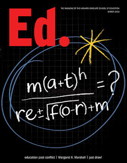
I enjoyed combining chalkboard with squared paper backgrounds, numerals and equations to illustrate the piece. The design team's simple but witty idea for the cover, a pseudo-math equation, was carefully rendered to read both as an equation and the subject of the article. Inside the magazine, I retained the simple colour palette to keep the more complex illustrations eye-catching and legible.
You can see more of my illustrative editorial work in my image>editorial folder on my portfolio site.


Hi Ruth... nice work I like the colors you always use.
ReplyDeleteLoris Bosk from Italy