You can see more of my editorial work here.
Monday, 22 December 2014
Festive Vignette for Country Living Christmas Issue
I was delighted to be asked by Country Living Magazine to draw this decorative vignette for the cover of their Christmas issue. Traditional rural imagery and cursive script were the inspiration for this festive piece.
You can see more of my editorial work here.
You can see more of my editorial work here.
Tuesday, 16 December 2014
The Art of McCartney Album Lettering
I was thrilled to be asked to work on the album lettering for The Art of McCartney.
Nearly 40 artists came together to contribute to this long awaited album, celebrating the songwriting of Sir Paul McCartney. Artists including Billy Joel, Bob Dylan, Brian Wilson, Willie Nelson, Alice Cooper, Smokey Robinson, The Cure, Chrissie Hynde and Kiss perform tracks from the former Beatle’s back catalogue. A fascinating documentary was also made of behind-the-scenes at the recording sessions.
Nearly 40 artists came together to contribute to this long awaited album, celebrating the songwriting of Sir Paul McCartney. Artists including Billy Joel, Bob Dylan, Brian Wilson, Willie Nelson, Alice Cooper, Smokey Robinson, The Cure, Chrissie Hynde and Kiss perform tracks from the former Beatle’s back catalogue. A fascinating documentary was also made of behind-the-scenes at the recording sessions.
I was asked to hand letter the names of the artists in a loose but legible script to fit within the square format for the vinyl and CD albums and box sets. Each layout was custom fitted to work with the individual products.
It’s always interesting working on music projects, but this one involved such an eclectic mix of famous artists, it was exciting to learn the line-up as they signed up to the album.
You can see more of this sort of work in my music folder on my website.
Monday, 1 December 2014
Dr Who DVD & Blu-ray Lettering
I’m always excited to work for Dr Who and this project was no exception.
After the recent success of the eighth BBC series with the Twelfth Doctor, the wonderful Peter Capaldi, I was delighted to work on the DVD and Blu-ray packaging. Asked to hand letter the chalkboard programme titles for the series, I took inspiration from the new TARDIS set. Playing around with the idea of chalk drawn mathematical equations and diagrams, I used arrows to organise the titles in the hexagonal space on the back covers.
If you’d like to see more of my Dr Who work it can be found in the TV folder on my website.
Thursday, 13 November 2014
Hand Lettered Titles for Wired Magazine
It was exciting to be asked to contribute to stylish Wired Magazine's November Issue.
The disturbing but fascinating subject of the article was data security - how safe is our personal information? The casual style of lettering was chosen to add a human touch to the layout and as a counterpoise to the beautifully balanced typographic grid.
Although viewed as red here, the printed magazine sees the lettering in a vibrant fluorescent orange which sings out from the page against the cool background colour.
See more of my editorial work on my portfolio website.
Labels:
data security,
editorial,
hand lettered titles,
Wired Magazine
Tuesday, 14 October 2014
Hand Lettered Author Logos - Kristin Hannah and Cathy Woodman
I’ve worked on quite a few author logos over the years, so I decided to gather them together and add them to a folder in the publishing section of my site. Today, I’m adding two new authors - Kristin Hannah and Cathy Woodman.
Two very different approaches for two very different authors. A soft mono-line script for Kristin Hannah’s beautiful dream-like covers and quirkier, more angular lettering to work with the lovely watercolour illustrations on Cathy Woodman’s series.
Friday, 3 October 2014
Becky Chilcott Design Logo
I was delighted to work on a logo for a new website launched this week by Becky Chilcott Design. A talented designer, working predominantly for the publishing industry, Becky also finds time to curate the talks at the wonderful St Bride Print Library here in London. Check out her blog if you get a chance - it’s a fascinating read.
Over the past few years I’ve enjoyed working on a range of logos. Clients include entrepreneurs with new products and starter businesses, authors (for both publishing houses and self-publishers), musicians (established and starting out), restaurants, wine merchants, magazines, confectioners, food manufacturers, hotels and even stately homes. You can see a selection of this work in the logos folder on my portfolio site.
Becky wanted to keep the site fresh and simple, so we decided on a loose mono-line script with open counters and a flowing line to complement the grid layout. The cool palette of grey, green and white with a touch of red adds to the open, uncluttered feel of the site.
Over the past few years I’ve enjoyed working on a range of logos. Clients include entrepreneurs with new products and starter businesses, authors (for both publishing houses and self-publishers), musicians (established and starting out), restaurants, wine merchants, magazines, confectioners, food manufacturers, hotels and even stately homes. You can see a selection of this work in the logos folder on my portfolio site.
Sunday, 28 September 2014
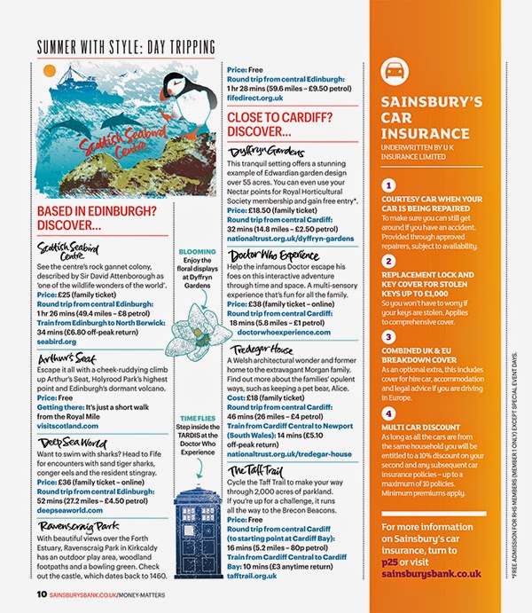
Maps and Hand Lettering for Sainsbury's Money Matters Magazine
I was delighted when Sainsbury’s Bank Money Matters Magazine asked me to create some maps and hand lettering for their Summer issues.
The subject was day trips in the UK and it involved creating two illustrated maps for two issues, one aimed at readers interested in family entertainment and one of general interest.
It was fascinating researching the locations found all over Britain, then creating spot illustrations to brighten up the maps. Each place name was individually hand lettered and this lettering was also used to punctuate the body copy of the articles. A smaller illustration for each map was also created for the second pages of the articles to sit alongside the spot illustrations. A hand lettered title and illustrated flag were included on the cover of the magazine to draw the reader’s eye to the article.
If you'd like to see more of my map and diagram work, click through to the maps folder on my portfolio site.
If you'd like to see more of my map and diagram work, click through to the maps folder on my portfolio site.
Friday, 15 August 2014
A Slice of Italy Lettering for Jamie Magazine
I chose some old and much loved brushes to work on this loose lettering for Jamie Magazine’s Italian Special. Designed to complement the rustic photography, it's inspired by Italian Paisan brush script.
To see more of my magazine work, click through to the editorial folder on my site.
Monday, 28 July 2014
Title Page and Spine Lettering for Lang Fairy Tales, The Folio Society
Even if you’re not a fairy tale fanatic as I am, who could fail to be inspired by these beautifully written stories by renowned folk tale writer and collector, Andrew Lang.
Gloriously illustrated by Caitlin Hackett and Kate Baylay, these luxuriant, boxed tomes, the Olive and Lilac Fairy Books, published by The Folio Society, are reminiscent of the old, linen-bound Edwardian books in my collection from childhood. With this in mind, I took Edwardian type as my inspiration and drew up the letters by hand, fitting them line by line within the illustrative borders of the title pages.
You can see more work I've done for both children's and adults books in the publishing folder on my portfolio site.
You can see more work I've done for both children's and adults books in the publishing folder on my portfolio site.
Friday, 27 June 2014
The Field of Cloth of Gold Hand Lettered Book Title
It was great to work on the title lettering for The Field of Cloth of Gold by Glenn Richardson.
A major Tudor event, The Field of Cloth of Gold, was a spectacular festival of competition and entertainment which aimed to secure a permanent settlement between England and France in 1520.
With that in mind, the title lettering had to be suitably ornate with a flavour of the period, while still being legible enough to read amongst a shelf of books. I opted for a loose informal hand and had some fun with the flourishes.
You can see more historic book title lettering in the publishing folder on my site.
Wednesday, 14 May 2014
Vintage Malamud Book Title Lettering
Vintage Classics has just released a series of Bernard Malamud novels with new covers designed in-house by Matt Broughton. I was delighted to be asked to work on the title lettering and designed some crisp vector drawn script to work with Matt's painterly, retro-inspired illustrations.
I like to work with a variety of media - both traditionally with brushes, pens and ink, as well as digitally. Recently I've been working on the possibilities of combining my hand lettered ink work with vector based drawings, opening up some interesting new avenues of exploration.
If you'd like to see more of what's interesting me at the moment, take a look at my side projects folder on my newly designed portfolio. If you're interested in book design you can see more of this work in my publishing folder.
Thursday, 24 April 2014
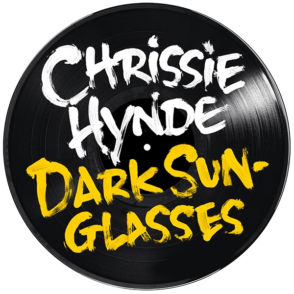
Lettering for Chrissie Hynde - Stockholm Album
If you've read NME lately, you'll know that Chrissie Hynde, lead singer of the Pretenders is going solo and is about to release her debut album, Stockholm on June 9th.
As a fan, I was delighted to be asked to work on the hand drawn lettering for the album and related singles. The rough brush lettering was designed to work with the wonderfully anarchic shots from the photoshoot.
You can see more of my record work in the music folder on my new website.
Monday, 31 March 2014
The Teardrop Island by Cherry Briggs
I was asked by Summersdale Publishers to design a cover for The Teardrop Island by Cherry Briggs.
The book follows in the footsteps of the eccentric Victorian, James Emerson Tennet, along a route which takes the author to pilgrimage trails, into tea reserves and rural regions inhabited by indigenous tribes, as well as restricted areas of the former warzone.
The book follows in the footsteps of the eccentric Victorian, James Emerson Tennet, along a route which takes the author to pilgrimage trails, into tea reserves and rural regions inhabited by indigenous tribes, as well as restricted areas of the former warzone.
Designing a complete cover is a new venture for me and one that I relished. Having put together some roughs, this vibrant red and purple design was chosen, giving a contemporary touch to the travelogue, while the distressed period type was a nod to the tale's Victorian inspiration.
I was also asked to draw a map of the route. I had some fun with this, researching Sri Lanka's tourist spots and making the most of the basic black print by creating simple distressed imagery and hand drawn lettering to echo the period feel of the cover type.
Labels:
Ceylon,
Cherry Briggs,
maps,
publishing,
Sri Lanka,
The Teardrop Island,
Victorian
Friday, 28 February 2014
Pilot Pen Advertising Campaign
I was delighted to be asked by the Zimmerman Agency in the US to work on their latest Pilot Pen Advertising Campaign.
A lettering artist's dream - a huge box turned up in the post stuffed full of Pilot pens in every colour of the rainbow. As you can imagine, I had a lot of fun working on these characters, developing different styles of handwriting appropriate to each ad.
Don't forget to double click on the image if you want to see it at a larger size.
Don't forget to double click on the image if you want to see it at a larger size.
Subscribe to:
Comments (Atom)


