I was excited to be asked by Interstate Creative Partners to contribute to the Volkswagen Motorsport WRC 2015 Calendar.
Much more than a simple calendar, this wall book gives a real insight into the WRC event, combining beautiful imagery with 'behind the scenes’ stories told by the team, from board members to chief mechanics. Héléna El Mokni provides photographs for each month, capturing a dynamic moment in the featured race.
I was asked to draw a set of 13 maps of the season's rallies to be printed on overlay sheets. These line drawings, titles and map keys were fitted around the focal point of the photography, half-seen through the translucent paper. The hand-crafted maps add to the deluxe quality of the book with loose line work specifically developed to reflect the excitement and energy of the event.
This large format, much-coveted wall book (some signed by the Polo driver crews) is a limited edition and has been very well received by Volkswagen sponsors, employees and members of the motorsport industry.
Showing posts with label maps. Show all posts
Showing posts with label maps. Show all posts
Friday, 30 January 2015


Sunday, 28 September 2014
Maps and Hand Lettering for Sainsbury's Money Matters Magazine
I was delighted when Sainsbury’s Bank Money Matters Magazine asked me to create some maps and hand lettering for their Summer issues.


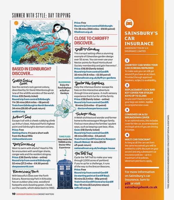


The subject was day trips in the UK and it involved creating two illustrated maps for two issues, one aimed at readers interested in family entertainment and one of general interest.
It was fascinating researching the locations found all over Britain, then creating spot illustrations to brighten up the maps. Each place name was individually hand lettered and this lettering was also used to punctuate the body copy of the articles. A smaller illustration for each map was also created for the second pages of the articles to sit alongside the spot illustrations. A hand lettered title and illustrated flag were included on the cover of the magazine to draw the reader’s eye to the article.
If you'd like to see more of my map and diagram work, click through to the maps folder on my portfolio site.
If you'd like to see more of my map and diagram work, click through to the maps folder on my portfolio site.
Monday, 31 March 2014
The Teardrop Island by Cherry Briggs
I was asked by Summersdale Publishers to design a cover for The Teardrop Island by Cherry Briggs.

The book follows in the footsteps of the eccentric Victorian, James Emerson Tennet, along a route which takes the author to pilgrimage trails, into tea reserves and rural regions inhabited by indigenous tribes, as well as restricted areas of the former warzone.


The book follows in the footsteps of the eccentric Victorian, James Emerson Tennet, along a route which takes the author to pilgrimage trails, into tea reserves and rural regions inhabited by indigenous tribes, as well as restricted areas of the former warzone.
Designing a complete cover is a new venture for me and one that I relished. Having put together some roughs, this vibrant red and purple design was chosen, giving a contemporary touch to the travelogue, while the distressed period type was a nod to the tale's Victorian inspiration.
I was also asked to draw a map of the route. I had some fun with this, researching Sri Lanka's tourist spots and making the most of the basic black print by creating simple distressed imagery and hand drawn lettering to echo the period feel of the cover type.
Tuesday, 28 June 2011
Delta Sky Magazine
Delta Airways Sky Magazine asked me to produce some hand lettered titles and a map of Paris for their stylish article about contemporary French culture.

This casual, edgy style of lettering was developed using a marker pen and runs throughout the article as subheadings, highlighting the work and opinions of an eclectic mix of influential French celebrities.


The map of Paris has a deliberately simple, casual style, reflecting it's subject - the bohemian Left Bank and the new areas now populated by artistes and academics in the working-class districts of the city's East End.

 Paris is one of my favourite cities to walk around, so discovering a new area to explore just gives me another reason to visit. If you'd like to see more of my maps - click through to my image>maps folder on my portfolio site.
Tuesday, 31 May 2011
Mapping the Dolomites

The article describes a drive through the beautiful Dolomite mountains in Italy. Small spot illustrations mark the main towns along the way and the loose brush lettering was also used throughout the copy as a visual link between word and image.
I've travelled to Italy frequently over the last few years and was delighted to explore an area of it that's new to me - now I just need to visit!

Friday, 30 April 2010
Mapping the World
 Recently I've been asked to illustrate some maps. This is a relatively new area of work for me and something I'm enjoying immensely. Maps allow me to combine my interests in lettering and illustration with my love of travel.
The Wall Street Journal Asia asked me to produce an illustrated map for their latest City Walk article for the colourful city of Mumbai. These maps involve quite a bit of research - luckily I'm helped by the journalists in situ who will answer questions and send images of anything I can't find online - between us we aim to capture the flavour of the city. The article it illustrates describes a walk through the city streets and I'm asked to read through the copy, pulling out any places I'd like to illustrate while highlighting the street names on the route. An image from the map is used on the second page of the article, I chose to develop the Joy Shoes illustration - somewhere I'd definitely like to shop!
 The second map was commissioned by Food and Travel Magazine - two of my favourite subjects. This is a much simpler design for their current pull-out magazine on Flanders. I enjoyed playing around with the fresh colours and open textures on this one. It will be printed quite small so it needed to be clear enough to be legible at a small size.
 Two maps with very different solutions!
The second map was commissioned by Food and Travel Magazine - two of my favourite subjects. This is a much simpler design for their current pull-out magazine on Flanders. I enjoyed playing around with the fresh colours and open textures on this one. It will be printed quite small so it needed to be clear enough to be legible at a small size.Two maps with very different solutions!
Subscribe to:
Posts (Atom)


 Posts
Posts


