Showing posts with label word as image. Show all posts

Friday, 22 February 2013

Do the math!

Harvard Graduate School of Education asked me to contribute to their Winter issue of Ed. Magazine. I worked on the cover, double page spread and half page illustration for an article about mathematics reform in the USA.


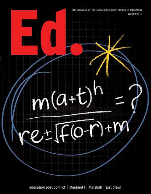
I enjoyed combining chalkboard with squared paper backgrounds, numerals and equations to illustrate the piece. The design team's simple but witty idea for the cover, a pseudo-math equation, was carefully rendered to read both as an equation and the subject of the article. Inside the magazine, I retained the simple colour palette to keep the more complex illustrations eye-catching and legible.


You can see more of my illustrative editorial work in my image>editorial folder on my portfolio site.


Tuesday, 29 January 2013

Simple Minds Greatest Hits Tour


This three dimensional bust was created for the Simple Minds Greatest Hits Tour. I was commissioned to develop the lettering, working with a range of different marker pens, then scanning and fitting the script to a photo of the head. It was built up gradually until the final image was approved. It's surprisingly tricky to keep the lettering looking raw and not overworked - this vernacular lettering is influenced more by Outsider Art and hand drawn ephemeral signage than by traditional calligraphy. The designer sent over images of the scrawled graffiti on Jim Morrison's grave and the Abbey Road sign as the inspiration for the piece - the fumes from the markers probably helped a little too ...

There are also plans to use it on the related album which has yet to be released. You can see more of my record work in the word>music folder on my site.

Wednesday, 31 October 2012

Which? Magazine Cover

I was delighted to be asked to create the cover lettering for the latest issue of Which? Magazine. It features an article about energy tariffs. It was clear from a recent questionnaire that few people understand them. This illustrative piece uses different styles, weights and sizes of lettering to indicate the different answers given and the general confusion on the subject.


You can see more of my magazine work in the word>editorial folder on my online portfolio and more illustrative lettering in the image section of the site.

Monday, 30 April 2012

Midsummer Night's Dream


Recently I've been working on a personal project inspired by Shakespeare's Midsummer Night's Dream.


The beautiful language is an ideal subject for the word-heavy imagery, which is influenced by my love of expressive typography. My aim is to get the feel of the spoken word across by combining letter and image.


I'm about to set up a blog dedicated to my personal work - read more about it in my next post.

Wednesday, 28 September 2011

We {Heart} Art for Teaching Tolerance Magazine

This month Teaching Tolerance Magazine features my hand lettered illustration on the opening page of its article, We {Heart} Art. The chalkboard style illustration combines word and image, using the opening copy to outline the affects on American pupils when vital arts programmes are cut.

This was one of several school-related options presented to the art director, who when he saw the chalkboard route, asked me to extend the illustration behind and around the opening paragraph to make a full page illustration, neatly combining the hand drawn lettering and typography.
You can see more of my illustrative work on the images page of my online portfolio.

Monday, 14 February 2011

Wishing you a Happy Valentine's Day!


This design is for a gift card for sale in Europe this Spring. You can see more of my greeting cards in the image>greeting folder on my portfolio site.