Showing posts with label editorial. Show all posts

Wednesday, 28 June 2017

Lettering for Four Four Two Magazine Messi Issue

It was great fun working on the hand lettering for the July issue of FourFourTwo Magazine with guest editor Messi


The work extended beyond the double cover to the opening article title lettering and can also be seen throughout the magazine in the form of smaller playful notes and jottings.


Guest edited by celebrated footballer, Messi, the design team at FourFourTwo wanted to give the magazine the personal touch with casual handwritten elements to complement the bold design.


As with all magazine work, the timings were tight so I worked closely with the Deputy Art Editor as the copy evolved and the design was finalised, both to the satisfaction of the design team and Messi’s sponsors, Adidas. 
It was a fast and furious job but a satisfying one - plus, I know a lot more about Messi than I did at the start of the project!

If you'd like to see more of my lettering and illustration for magazines, head over to the editorial folder on my portfolio site where you'll see an interesting variety of commissions for different publications.

Thursday, 30 March 2017

Spring forward with Country Living plus Paper Mapping

The start of British Summertime means the clocks have gone forward an hour here in the UK, so with lighter evenings and the promise of finer weather, Spring-inspired news seems in order. 


Few magazines do Spring better than Country Living, so here’s an update on some of the work that I’ve been producing during my ongoing project with Country Living over the past year.


If you’re familiar with the magazine, you’ll be used to seeing my tonal watercolour lettering throughout its pages. Designed to work within the page layout, the bespoke brush lettering complements the elegant typography but is still bold enough to sit across a photographic background. The work itself is produced by hand, scanned and dropped onto the page for fine tuning. This kind of attention to detail ensures the lettering perfectly matches the article’s colour palette and remains legible over any background texture.


Aside from pullquotes, I also work on logos related to the magazine. Generally these are looser and more expressive, while still being carefully designed to fit within the space available - a fine balance between freedom and control.


If you’d like to see more of my magazine work, click through to the editorial folder on my website.


Paper Mapping

Since attending a creative mapping course at the British Library earlier this year, I’ve been enjoying exploring handmade books, playing with paper and experimenting with folds - see below my London map fold.


If paper is your thing, you can see more of this experimental work on my Mapmaker FB and Instagram pages.

Wednesday, 20 January 2016

Rewriting History - Teaching Tolerance Magazine Lettering

I was delighted to be asked by Southern Poverty Law Center to contribute to their magazine, Teaching Tolerance.

The article, Rewriting History - for the Better, highlights how the US social studies curricula fails to tell the tragic and complicated story of the nations original inhabitants.

After working through some initial ideas, this fluid, mono linear pen style was chosen to complement Julie Flett’s atmospheric illustration on the article’s opening double page spread.

See more titles and pull quotes like these in the editorial folder on my site, as well as mastheads, maps and letter-heavy illustration.


Wednesday, 25 November 2015

Pixar Lettering for Wired Magazine

It was exciting to be asked to work on the lettering for Wired Magazine’s fascinating article on Pixar’s John Lasseter.

Referencing early animation titling and sign writing brush script, I was asked to develop a sympathetic style that would work with the dynamic opening page photograph. It’s always great when an art director gives you this sort of challenge, short on time and with quite a bit of copy, I immediately started experimenting with a variety of brushes and papers to get the feel I was after.

Finally settling on this softly textured brush stroke and controlled script form, I completed the title as well as additional lettering throughout the article. As ever with Wired Magazine, it was a pleasure to see how the hand drawn forms complemented the abundant colour photography and vibrant design of the piece.

Click through to my editorial folder to see more of the project.


Monday, 20 April 2015

Smartphone Satellite Lettering for Wired Magazine

It was great to work with stylish Wired Magazine again on this fascinating article about satellite technology, the story of how DIY team, Planet Labs, 'used smartphone tech and energy bars to take on national governments …’


This textural marker pen lettering adds a casual touch to the vibrant imagery and clean typography throughout the article. Its informal ‘notepad’ layout, arrows and underscores reflecting the hands on approach of Planet Labs as they launch satellites, using off-the-shelf smartphone components and in-house production to monitor our real-time world.


If you’d like to see more of my work with Wired Magazine you’ll find it in the editorial folder on my website.


Monday, 22 December 2014

Festive Vignette for Country Living Christmas Issue

I was delighted to be asked by Country Living Magazine to draw this decorative vignette for the cover of their Christmas issue. Traditional rural imagery and cursive script were the inspiration for this festive piece.

You can see more of my editorial work here.

Merry Christmas everyone!

Thursday, 13 November 2014

Hand Lettered Titles for Wired Magazine

It was exciting to be asked to contribute to stylish Wired Magazine's November Issue.

The disturbing but fascinating subject of the article was data security - how safe is our personal information? The casual style of lettering was chosen to add a human touch to the layout and as a counterpoise to the beautifully balanced typographic grid.

Although viewed as red here, the printed magazine sees the lettering in a vibrant fluorescent orange which sings out from the page against the cool background colour.

See more of my editorial work on my portfolio website.


Sunday, 28 September 2014

Maps and Hand Lettering for Sainsbury's Money Matters Magazine

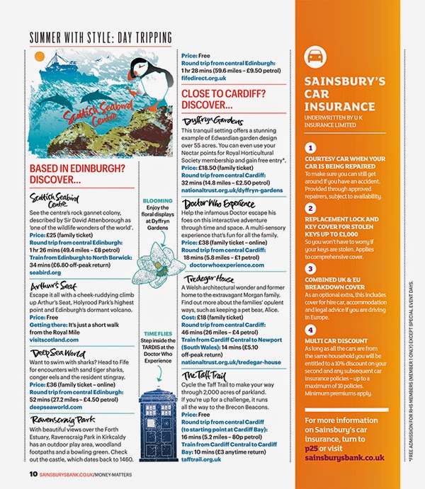
I was delighted when Sainsbury’s Bank Money Matters Magazine asked me to create some maps and hand lettering for their Summer issues. 

The subject was day trips in the UK and it involved creating two illustrated maps for two issues, one aimed at readers interested in family entertainment and one of general interest. 

It was fascinating researching the locations found all over Britain, then creating spot illustrations to brighten up the maps. Each place name was individually hand lettered and this lettering was also used to punctuate the body copy of the articles. A smaller illustration for each map was also created for the second pages of the articles to sit alongside the spot illustrations. A hand lettered title and illustrated flag were included on the cover of the magazine to draw the reader’s eye to the article.

If you'd like to see more of my map and diagram work, click through to the maps folder on my portfolio site.


Friday, 15 August 2014

A Slice of Italy Lettering for Jamie Magazine

I chose some old and much loved brushes to work on this loose lettering for Jamie Magazine’s Italian Special. Designed to complement the rustic photography, it's inspired by Italian Paisan brush script.

To see more of my magazine work, click through to the editorial folder on my site.


Monday, 15 July 2013

Savor the Sizzle for Prevention Magazine

Prevention, a healthy lifestyle magazine in the US, asked me to hand letter the titles for a recent article about grilled foods. They wanted something with a little casual flair to complement their stylish layouts.


 This work is created using marker pens - something I've recently been experimenting with alongside my more traditional media. I bought a selection of pens for demonstrating at ScrapbookLive, spending much time in art shops prior to the event testing the different tip designs and line weights. 


I was later asked to help with product development at ColArt, owner of the Griffin Gallery where we exhibited. ColArt comprises a group of famous art materials companies with origins dating back to the early 18th Century, including such well known names as Winsor & Newton, Liquitex and Conté à Paris. I have to confess I am a pen geek so this sort of analytical work, alongside product designers, marketing people and scientists was fascinating to me - with the added advantage that input from artists ensures that products available for sale answer our needs. A win-win situation.


You can see more of my editorial work on my own website or my recently updated agent's site.

Friday, 22 February 2013

Do the math!

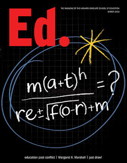
Harvard Graduate School of Education asked me to contribute to their Winter issue of Ed. Magazine. I worked on the cover, double page spread and half page illustration for an article about mathematics reform in the USA.


I enjoyed combining chalkboard with squared paper backgrounds, numerals and equations to illustrate the piece. The design team's simple but witty idea for the cover, a pseudo-math equation, was carefully rendered to read both as an equation and the subject of the article. Inside the magazine, I retained the simple colour palette to keep the more complex illustrations eye-catching and legible.


You can see more of my illustrative editorial work in my image>editorial folder on my portfolio site.