Showing posts with label music. Show all posts

Tuesday, 29 November 2016

Lettering for Kate Bush's Live Album - Before the Dawn

I was thrilled to be asked to work on the new album lettering for long-time musical hero, Kate Bush.


Before The Dawn was recorded during the extraordinary run of 22 shows performed by Kate at London’s Hammersmith Apollo, 2014 and released November 2016.


Earlier in the year, I was asked by renowned music industry designers, Stuart Crouch Creative, to develop a range of hand lettering to work with the CD cover photography and inner booklet pages. I immediately immersed myself in Kate Bush’s music, from the early albums that influenced my teenage years to the latest magical performances from the 2014 shows.


I decided to develop some loose brush work, not too formal but still legible with a striated, textural ebb and flow that complemented the richly-coloured photography taken from the showRead on ...

Limited Editions Prints

I've added a small selection of limited edition prints to my site.


Seen here is Cathy Print - an evocative quote taken from Emily Brontë's Wuthering Heights. Cathy's heartfelt words as she yearns for the days of her youth spent with Heathcliff on the moors. 

One of the perks of my job is being able to play music in the studio, so you can easily imagine what was playing while I was working on this piece ...

Thursday, 28 July 2016

Hand Lettering for Simple Minds New Gold Dream Deluxe Boxset & Country Living Video

It was exciting to be asked to work on the hand drawn lettering for the New Gold Dream Deluxe Boxset. I remember its original release in 1982, Simple Minds’ fifth studio album, taking them from revered cult status to a chart band with hit singles and a full year in the UK album chart.


With the original New Gold Dream design as a starting point, I developed a sympathetic style of pen-drawn Roman Capital lettering for four of the disc covers within this collectible boxset. The challenge was to create new custom drawn titles for the fresh designs that also worked with the original 1982 cover.


It’s always a pleasure to open up a well designed boxset and this one didn’t disappoint with its inventive packaging, wrap, ribbon and booklets - it delivered in spades. When you work on a project like this, I imagine it’s much like being an actor in a film, you understand the concept and all the parts you worked on in detail but it’s only when you see the completed piece that you appreciate the whole.  


An inspired collection of remastered album, mixes, radio sessions, videos and tv footage, the stylish design lives up to its content. If you’re a Simple Minds fan - you’ll want it in your collection.

To see the rest of the individual wallets in more detail or more of my lettering for album titles and band logos check out the music folder on my portfolio site.


Online Update: Brush Lettering for Country Living Magazine

I've enjoyed working for Country Living since their design refresh at the beginning of the year, providing hand lettered logos, titles and pull quotes for the magazine each month. Last week I was asked into their London office to be videoed in action with my brush pens. Unnerving but certainly fun!

I also have a modest set up in the studio for videoing, handling a pen and camera at the same time takes a certain amount of practice but I'm slowly getting the hang of it. You can see some of my self promotional work below for the July issue of Country Living.

To read more about the job, head over to my website editorial folder or see more of my lettering videos on my Facebook Page.


Wednesday, 16 December 2015

Album Lettering for Paul Carrack's Soul Shadows

It’s been a busy few months and one of the projects I’ve really enjoyed working on is the hand lettering for Paul Carrack’s new album release, Soul Shadows.


The album has come in the wake of Paul Carrack’s time as featured vocalist and keyboard player in Eric Clapton’s band for his UK and international tour, the result of their longtime friendship and mutual respect.

I was commissioned to work on the album title and track list by Ian Ross, an old friend and much respected designer I first worked for over 20 years ago at Bill Smith Design. It was Ian who introduced me to Paul Carrack’s music some years ago, an artist well known in the industry as a ‘musician’s musician’, so I was delighted to have the chance to contribute something to the album design.


With a loose but legible letterform in mind, I decided to work with brush to create a fluid but slightly raw and not ‘too perfect’ line for the lettering. You can see the hand lettered Paul Carrack logo in use on his official website, while the album and track titles are positioned throughout the packaging design in vibrant turquoise to contrast with the soulful greys and blue-blacks of Paul Cox’s moody photography.

You can see more on this project and my hand lettering for the record industry in my music folder.


Wednesday, 28 October 2015

Simple Minds v The Stranglers Limited Edition Single Lettering

Thrilled to work on the lettering for a new single brought out by these two era-defining bands, Simple Minds and The Stranglers

To celebrate their forthcoming tour together, when The Stranglers will be special guests of Simple Minds, the bands got together to record a version of The Stranglers' 1977 punk classic, '(Get A) Grip (On Yourself)'. Influenced by The Stranglers and the Punk ethos in general, read Jim Kerr's thoughts on first seeing the band live when they performed in Glasgow.


Created with a pen I made specifically to capture the raw energy and anarchism of Punk, I hand lettered the single title and added it to distressed versions of the bands' iconic logos. I had some fun working on a range of options (some of which you can see on my website) before this version was settled on.  It was then printed as a limited edition onto collectible 7" white vinyl in black and vibrant green.

You can see more of my work for Simple Minds and the music industry here.


Friday, 16 October 2015

Cliff Richard Album Lettering, 75 at 75


It was great to be asked to work on Cliff Richard’s latest release, a triple-disc collection of his greatest hits celebrating his 75th birthday, called appropriately, 75 at 75.

It includes a new song, Golden, a tribute to his famously loyal fans and with that in mind, the cover was designed as a visual reminder of his first album cover, Cliff, released in 1959. Devoted fans who have the record in their collection will see that the the original title lettering has been reused in celebration of his 75 years in the industry.

It was good fun getting out my brushes, listening to some of Cliff’s early hits for inspiration and working on the Living Doll and Move It track titles to develop a sympathetic lettering style to the original 50’s lettering.

Happy Birthday Cliff!


Tuesday, 28 July 2015

Lettering for Bill Wyman - Back to Basics Album

Having worked on his website logo, I was delighted to be asked to work on the latest Bill Wyman album - Back to Basics.


His first solo album here in the UK since 1982, Back to Basics is stripped back, clean and accomplished. To reflect this approach, I kept it simple - working with pencil, I produced sheet after sheet of name and title script until the forms were fluid and relaxed, yet still legible. I’ve been working quite a bit with pencil recently and have enjoyed exploring its versatility as a lettering tool.


The theme was continued on the album inlay with song titles drawn and fitted to the shape of Bill’s guitar, with matching script on the disc labelling and the single, What & How & If & When & Why.


You can see more of my work for Bill Wyman and the music industry on my portfolio site.

Tuesday, 16 December 2014

The Art of McCartney Album Lettering

I was thrilled to be asked to work on the album lettering for The Art of McCartney.

Nearly 40 artists came together to contribute to this long awaited album, celebrating the songwriting of Sir Paul McCartney. Artists including Billy Joel, Bob Dylan, Brian Wilson, Willie Nelson, Alice Cooper, Smokey Robinson, The Cure, Chrissie Hynde and Kiss perform tracks from the former Beatle’s back catalogue. A fascinating documentary was also made of behind-the-scenes at the recording sessions.

I was asked to hand letter the names of the artists in a loose but legible script to fit within the square format for the vinyl and CD albums and box sets. Each layout was custom fitted to work with the individual products. 

It’s always interesting working on music projects, but this one involved such an eclectic mix of famous artists, it was exciting to learn the line-up as they signed up to the album.

You can see more of this sort of work in my music folder on my website.


Thursday, 24 April 2014

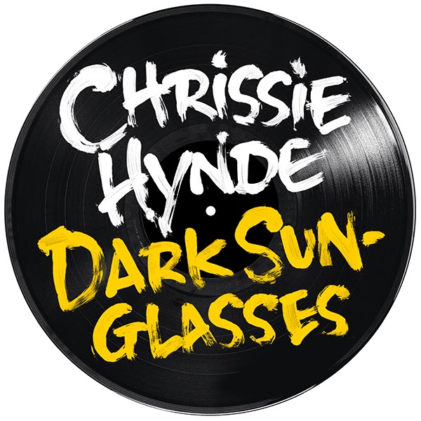
Lettering for Chrissie Hynde - Stockholm Album

If you've read NME lately, you'll know that Chrissie Hynde, lead singer of the Pretenders is going solo and is about to release her debut album, Stockholm on June 9th.

As a fan, I was delighted to be asked to work on the hand drawn lettering for the album and related singles. The rough brush lettering was designed to work with the wonderfully anarchic shots from the photoshoot. 

You can see more of my record work in the music folder on my new website.


Thursday, 28 November 2013

Bill Wyman Website Logo


It was great to work on the new Bill Wyman logo for his official website. 

The development stage included a range of hand rendered styles, from handwriting akin to his own signature to this wilder version of his name, using a dry brush to create a distressed, edgy mark.

Combined with the designer's bold background and retro photo, the lettering makes a powerful impact on the music legend's home page.

If you want to see more of my music work, click through to the word>music folder on my online portfolio.

Tuesday, 29 January 2013

Simple Minds Greatest Hits Tour


This three dimensional bust was created for the Simple Minds Greatest Hits Tour. I was commissioned to develop the lettering, working with a range of different marker pens, then scanning and fitting the script to a photo of the head. It was built up gradually until the final image was approved. It's surprisingly tricky to keep the lettering looking raw and not overworked - this vernacular lettering is influenced more by Outsider Art and hand drawn ephemeral signage than by traditional calligraphy. The designer sent over images of the scrawled graffiti on Jim Morrison's grave and the Abbey Road sign as the inspiration for the piece - the fumes from the markers probably helped a little too ...

There are also plans to use it on the related album which has yet to be released. You can see more of my record work in the word>music folder on my site.

Wednesday, 30 November 2011

Twiggy - Romantically Yours

Having worked on the latest release from Cliff Richard this summer, it was great to be asked to work for another British icon - Twiggy. Released by EMI, Twiggy's brand new album Romantically Yours marks a return to her music career with a collection of her hand-picked favourites.

I was asked to work on the artist's name for the CD cover and started by taking her signature as my original reference. Using a dip ink pen that was sympathetic to the line quality and flow of the signature, I fine tuned the letter forms and opened up the letter spacing to maximise legibility while trying to keep the spontaneity and character of the original.

To see more of my music work - click through to my word>music folder on my portfolio site.

Friday, 28 October 2011

Cliff Richard - Soulicious


Released by EMI, Soulicious is the latest album from Cliff Richard, a collection of duets featuring some of the most respected names in soul music, including Roberta Flack, Dennis Edwards and Freda Payne.

I was delighted to be asked to produce the album title, using sophisticated thick and thin curves to add a lyrical flow to the letters. The hand drawn lettering was commissioned to give a personal touch to the elegant cover design. More lettering and calligraphic swashes continue the style across the CD packaging.


You can see more of my music work by clicking through to the word>music folder on my portfolio.

Friday, 29 October 2010

James Blunt Album


It's been a musical Summer - hot on the heels of the Lennon job, I was asked to work on James Blunt's new album, Some Kind Of Trouble plus his latest single, Stay The Night. The album is due to be released on the 8th November and the single on the 25th October.


The loose brush lettering was created to work with the overall design of the packaging which has an old school, scrapbook feel. The layouts were put together traditionally with sellotape and paper and then photographed, so I felt my lettering needed to be as raw and immediate as possible to work with the designs. The style was also taken through to James Blunt's new website: www.jamesblunt.com


If you'd like to see more of my music work take a look at my word>music folder on my website.