
Wednesday, 18 December 2013
Thursday, 28 November 2013
Bill Wyman Website Logo

It was great to work on the new Bill Wyman logo for his official website.
The development stage included a range of hand rendered styles, from handwriting akin to his own signature to this wilder version of his name, using a dry brush to create a distressed, edgy mark.
Combined with the designer's bold background and retro photo, the lettering makes a powerful impact on the music legend's home page.
If you want to see more of my music work, click through to the word>music folder on my online portfolio.
Wednesday, 23 October 2013
The Fourth Doctor Time Capsule
I had great fun working on the lettering for the limited edition Fourth Doctor Time Capsule for the BBC.

It's a delightfully inventive design that includes a range of Tom Baker goodies; a letter from the man himself, an exclusive action figure, DVDs, audio book and novel - not to mention a sonic screw driver!


Aimed at the dedicated fan, this is a luxury product celebrating Tom Baker and the 50th Anniversary of the Dr Who TV series, with a limited run of 5,000. Lovingly put together, the attention to detail in this box set makes it a pleasure to open - I plan to keep the sonic screw driver in my handbag, just in case ...


It's a delightfully inventive design that includes a range of Tom Baker goodies; a letter from the man himself, an exclusive action figure, DVDs, audio book and novel - not to mention a sonic screw driver!

The box itself is designed to look like a Gallifreyan artefact and with this in mind, I was asked to create both English and Gallifreyan lettering for the DVD covers. This involved some very enjoyable research, looking at stills from old Doctor Who episodes and discussing the appropriate feel and layout of the two different alphabets with the art director. Once printed the title had the added bonus of only being legible once seen through the coloured disc provided.

Aimed at the dedicated fan, this is a luxury product celebrating Tom Baker and the 50th Anniversary of the Dr Who TV series, with a limited run of 5,000. Lovingly put together, the attention to detail in this box set makes it a pleasure to open - I plan to keep the sonic screw driver in my handbag, just in case ...

Friday, 4 October 2013
Never Say Never iPhone case
I was recently asked to work on Chalkies, the latest range of iPhone cases for QDOS.

Working with the creative team at NOMO Design, this old school chalk lettering was repeatedly redrawn faster and looser until the right broken, sketchy feel was achieved. Working with chalk has its challenges, thankfully, I'm quite old school myself so I'm used to taking traditional media and translating them into a digital format.


Working with the creative team at NOMO Design, this old school chalk lettering was repeatedly redrawn faster and looser until the right broken, sketchy feel was achieved. Working with chalk has its challenges, thankfully, I'm quite old school myself so I'm used to taking traditional media and translating them into a digital format.

The chalkboard look and retro styling was inspired by vintage branding, making it a particularly interesting job to research.
Friday, 23 August 2013
Type Tasting at the V&A Museum, London
I like nothing better than to have the opportunity to get hands on and that's what Tasting Type is all about. Run as part of the London Design Festival at the Victoria & Albert Museum, the Type Tasting exhibition and drop in workshops are open to everyone with a love of letterforms.

I submitted a piece of work for the exhibition, we had to choose a word that described London. I was drawn to the word 'expressive' as it reflects what I love most about London - its dynamic, ever-changing cultural scene. In addition, it's a term often used to describe the loose, gestural nature of much of my work.

I like to experiment with mark making, tools can vary from the beautifully hand crafted ruling pen used here, to a piece of old stick from my mother's garden. Pens and brushes are the tools of my trade, I've been collecting them for years, I like the fact that each one has its own distinctive characteristics.

Things can get messy with expressive mark making, the studio looked like an explosion in an ink factory after a morning working on the project. If you'd like to see me in action, I demonstrated with this pen at ScrapbookLive. Luckily, Sarah Hyndman, type enthusiast and work shop leader extraordinaire, isn't frightened of a bit of mess and I'll be helping out at the workshops on the 14th and 15th September. So if you like to get hands on too, then roll up your sleeves and come along.

Monday, 15 July 2013
Savor the Sizzle for Prevention Magazine
Prevention, a healthy lifestyle magazine in the US, asked me to hand letter the titles for a recent article about grilled foods. They wanted something with a little casual flair to complement their stylish layouts.

This work is created using marker pens - something I've recently been experimenting with alongside my more traditional media. I bought a selection of pens for demonstrating at ScrapbookLive, spending much time in art shops prior to the event testing the different tip designs and line weights.


This work is created using marker pens - something I've recently been experimenting with alongside my more traditional media. I bought a selection of pens for demonstrating at ScrapbookLive, spending much time in art shops prior to the event testing the different tip designs and line weights.

I was later asked to help with product development at ColArt, owner of the Griffin Gallery where we exhibited. ColArt comprises a group of famous art materials companies with origins dating back to the early 18th Century, including such well known names as Winsor & Newton, Liquitex and Conté à Paris. I have to confess I am a pen geek so this sort of analytical work, alongside product designers, marketing people and scientists was fascinating to me - with the added advantage that input from artists ensures that products available for sale answer our needs. A win-win situation.

You can see more of my editorial work on my own website or my recently updated agent's site.
Thursday, 23 May 2013
Demonstrating at ScrapbookLive
A couple of weeks ago I demonstrated calligraphy at ScrapbookLive at the Griffin Gallery, London, an event organised by my agent, Illustration Ltd. The evening had a real buzz with a large gallery full of artist and clients, five of us demonstrating our various disciplines and art-savvy journalist, Garrick Webster interviewing illustrators throughout the evening. DJ Dirty Freud (aka musician/poet Danni Skerritt) kept us listening throughout the evening and added to the party atmosphere.


On the night we heard from Ben Tallon about Xpress, an awareness campaign on behalf of CALM (Campaign Against Living Miserably) and the staggeringly high suicide rate amongst young British men. You can read more about his mission in this interview and if you would like to express your support - buy the album here via this link too (I can recommend it).
The evening was impressively organised by Vicky and the team at Illustration Ltd and curated by talented fashion illustrator, Montana Forbes - who also gets points for wearing the fiercest shoes of the evening. My agent is planning more of these evenings, so if you're London based or just happy to travel, follow them online on Twitter @Illustrationweb. They should also be posting video of the event - illustrator interviews as well as demonstrations (and if we're lucky the aforementioned shoes).
I'll be posting more close ups of the 3D letters on my sister site for personal work: A Word in Your Eye.
Tuesday, 30 April 2013
Scrapbook Live Event
On the 9th May I'll be showing work at the Scrapbook Live Event, Griffin Gallery, London, organised by my agent Illustration Ltd. I have my pens, brushes and inks primed for some pretty wild and loose demonstrating. Alongside the calligraphic work, I'll be showing some 3D letters created especially for the event, combining type with my own hand lettering in a variety of media.


It promises to be an exciting evening with illustrators Miss Led, Jacqueline Bissett, Sarah Beetson and Gail Armstrong all demonstrating alongside me. In total, twenty one artists will be showing work and the evening will be hosted by journalist and writer Garrick Webster with sounds by DJ Dirty Freud.
Hope to see you there on the evening or you can follow the event live on twitter at #ScrapbookLive.
Friday, 29 March 2013
Katie Piper Author Lettering
I was asked to work on Katie Piper's author lettering by Quercus Publishing. She's well known here in the UK as an inspiration to many, due to her positive outlook and sheer determination to survive a brutal rape and acid attack that left her with deep physical and emotional scars. Things Get Better is a book written to support those who have suffered trauma, drawing on her own experiences and the letters of other survivors.


The aim was to keep the style fresh, dynamic and approachable to reflect the writer's strength and compassion - I was delighted when is was decided to use it on her next book, Start Your Day With Katie.

To see more of my book lettering click onto my word>publishing folder on my online portfolio.
Friday, 22 February 2013
Do the math!
Harvard Graduate School of Education asked me to contribute to their Winter issue of Ed. Magazine. I worked on the cover, double page spread and half page illustration for an article about mathematics reform in the USA.
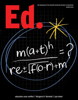
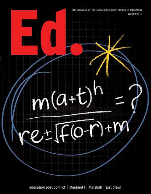
I enjoyed combining chalkboard with squared paper backgrounds, numerals and equations to illustrate the piece. The design team's simple but witty idea for the cover, a pseudo-math equation, was carefully rendered to read both as an equation and the subject of the article. Inside the magazine, I retained the simple colour palette to keep the more complex illustrations eye-catching and legible.


You can see more of my illustrative editorial work in my image>editorial folder on my portfolio site.

Tuesday, 12 February 2013
The Briem Report 2012
Renowned Icelandic type designer, calligrapher and publisher, Gunnlaugur SE Briem has put together a book on lettering that captures a moment in time.

With over a hundred contributors from all over the globe, subjects include graffiti, handwriting, calligraphy, lettering, type design, typography and research. Although subjects vary, all are united in their love of letters and each has created a double page spread to discuss current work.

I've contributed myself and was delighted to see many of my favourite artists listed in the contents page. It's an eclectic and inspirational read, includes an amusing introduction by Briem himself and what's more - it's free. You can download your own copy from operina.com.
Tuesday, 29 January 2013
Simple Minds Greatest Hits Tour

This three dimensional bust was created for the Simple Minds Greatest Hits Tour. I was commissioned to develop the lettering, working with a range of different marker pens, then scanning and fitting the script to a photo of the head. It was built up gradually until the final image was approved. It's surprisingly tricky to keep the lettering looking raw and not overworked - this vernacular lettering is influenced more by Outsider Art and hand drawn ephemeral signage than by traditional calligraphy. The designer sent over images of the scrawled graffiti on Jim Morrison's grave and the Abbey Road sign as the inspiration for the piece - the fumes from the markers probably helped a little too ...

Subscribe to:
Comments (Atom)


