Showing posts with label brush lettering. Show all posts

Monday, 24 April 2017

Isabelle Broom Book Title Lettering plus Brush Lettering Demonstration

Having worked on the title for Isabelle Broom's debut novel published by Penguin Michael Joseph, I was delighted to be asked to work on more of her books.


Loose brush lettering was chosen to work with the atmospheric background imagery of the first novel, My Map of You and we continued in style with flowing lines and textures to draw the reader in. 


If you're an Isabelle Broom fan, there's more to look forward to, as I'm currently working on the next in the series ...


If you'd like to see more of my book cover lettering, click through to the publishing folder on my portfolio website.


Brush Lettering Demo at the SSI Lay Members' Day, London

I was thrilled to be asked to demonstrate and talk about my lettering work in the graphics industry at the celebrated Society of Scribes and Illuminators' Lay Members' Day on Saturday 29th April, 10am to 1pm. As time is short, I've decided to focus on a couple of my ongoing jobs - Country Living Magazine and Heathrow Welcome Campaign. I'll be bringing along samples of these jobs and a selection of my other work to show and discuss, while demonstrating brush pen lettering.


If you're interested in attending or would just like to see what's on, you can see details on the day's events here. Hope to see you there!

Thursday, 30 March 2017

Spring forward with Country Living plus Paper Mapping

The start of British Summertime means the clocks have gone forward an hour here in the UK, so with lighter evenings and the promise of finer weather, Spring-inspired news seems in order. 


Few magazines do Spring better than Country Living, so here’s an update on some of the work that I’ve been producing during my ongoing project with Country Living over the past year.


If you’re familiar with the magazine, you’ll be used to seeing my tonal watercolour lettering throughout its pages. Designed to work within the page layout, the bespoke brush lettering complements the elegant typography but is still bold enough to sit across a photographic background. The work itself is produced by hand, scanned and dropped onto the page for fine tuning. This kind of attention to detail ensures the lettering perfectly matches the article’s colour palette and remains legible over any background texture.


Aside from pullquotes, I also work on logos related to the magazine. Generally these are looser and more expressive, while still being carefully designed to fit within the space available - a fine balance between freedom and control.


If you’d like to see more of my magazine work, click through to the editorial folder on my website.


Paper Mapping

Since attending a creative mapping course at the British Library earlier this year, I’ve been enjoying exploring handmade books, playing with paper and experimenting with folds - see below my London map fold.


If paper is your thing, you can see more of this experimental work on my Mapmaker FB and Instagram pages.

Tuesday, 29 November 2016

Lettering for Kate Bush's Live Album - Before the Dawn

I was thrilled to be asked to work on the new album lettering for long-time musical hero, Kate Bush.


Before The Dawn was recorded during the extraordinary run of 22 shows performed by Kate at London’s Hammersmith Apollo, 2014 and released November 2016.


Earlier in the year, I was asked by renowned music industry designers, Stuart Crouch Creative, to develop a range of hand lettering to work with the CD cover photography and inner booklet pages. I immediately immersed myself in Kate Bush’s music, from the early albums that influenced my teenage years to the latest magical performances from the 2014 shows.


I decided to develop some loose brush work, not too formal but still legible with a striated, textural ebb and flow that complemented the richly-coloured photography taken from the showRead on ...

Limited Editions Prints

I've added a small selection of limited edition prints to my site.


Seen here is Cathy Print - an evocative quote taken from Emily Brontë's Wuthering Heights. Cathy's heartfelt words as she yearns for the days of her youth spent with Heathcliff on the moors. 

One of the perks of my job is being able to play music in the studio, so you can easily imagine what was playing while I was working on this piece ...

Friday, 16 October 2015

Cliff Richard Album Lettering, 75 at 75


It was great to be asked to work on Cliff Richard’s latest release, a triple-disc collection of his greatest hits celebrating his 75th birthday, called appropriately, 75 at 75.

It includes a new song, Golden, a tribute to his famously loyal fans and with that in mind, the cover was designed as a visual reminder of his first album cover, Cliff, released in 1959. Devoted fans who have the record in their collection will see that the the original title lettering has been reused in celebration of his 75 years in the industry.

It was good fun getting out my brushes, listening to some of Cliff’s early hits for inspiration and working on the Living Doll and Move It track titles to develop a sympathetic lettering style to the original 50’s lettering.

Happy Birthday Cliff!


Saturday, 26 September 2015

New Logo for St Luke's Hospice

I always enjoy working on branding, so when Ledgard Jepson Design contacted me to help out with a new logo for St Luke’s Hospice, Sheffield, I jumped at the chance.

Ledgard Jepson, specialists in branding and well known for their recent rebrand of Birmingham Museums Trust, worked closely with the client to develop a logo that evokes a positive, upbeat message. After much care and consideration, it was decided this was best achieved with a piece of custom lettering, giving St Luke’s Hospice a unique, hand drawn mark that is instantly recognisable. 

Once briefed, I collaborated with the creative team at Ledgard Jepson, providing initial brush drawn options. These were gradually developed and drawn up digitally, while taking care to retain the hand drawn appeal of the script.

The warm colour, soft curves and playful nod at smiles and hearts keep the lettering fresh and friendly, while the bold weight and clean design give it the visual strength to work across a range of applications.

You can see more of my lettering for branding in the logos folder on my portfolio website.


Friday, 27 March 2015

Hand Lettering for Simple Minds Big Music Tour Guide

It was great to be working for Simple Minds again - producing the hand rendered lettering for the beautifully designed 2015 Big Music Tour Guide.

In keeping with the ongoing trend for vernacular lettering, this tonal brush lettering is laid over the atmospheric tour shots, capturing and intensifying the immediacy of the moment. The bright, raw lettering compliments the vibrant photography and adds a pop of colour to moody grayscale shots.

If you’d like to see more of my Simple Minds work, check out the music folder on my website.


Thursday, 24 April 2014

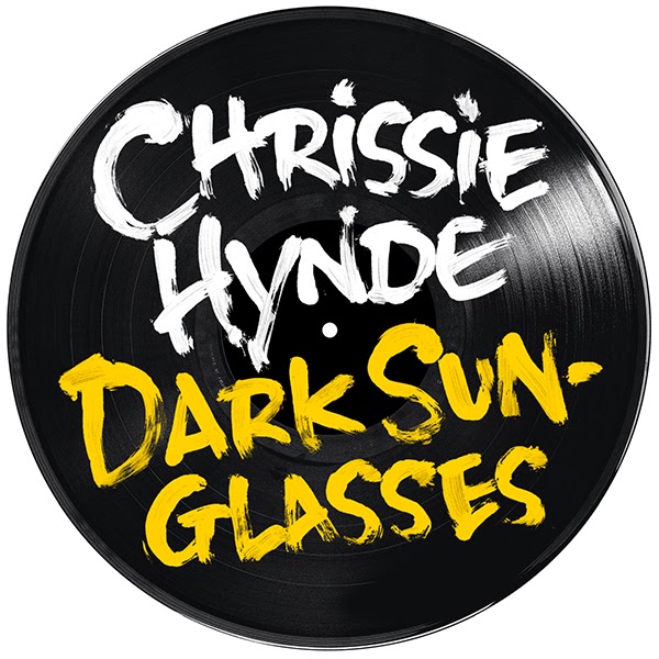
Lettering for Chrissie Hynde - Stockholm Album

If you've read NME lately, you'll know that Chrissie Hynde, lead singer of the Pretenders is going solo and is about to release her debut album, Stockholm on June 9th.

As a fan, I was delighted to be asked to work on the hand drawn lettering for the album and related singles. The rough brush lettering was designed to work with the wonderfully anarchic shots from the photoshoot. 

You can see more of my record work in the music folder on my new website.