Showing posts with label hand lettering. Show all posts

Thursday, 30 March 2017

Spring forward with Country Living plus Paper Mapping

The start of British Summertime means the clocks have gone forward an hour here in the UK, so with lighter evenings and the promise of finer weather, Spring-inspired news seems in order. 


Few magazines do Spring better than Country Living, so here’s an update on some of the work that I’ve been producing during my ongoing project with Country Living over the past year.


If you’re familiar with the magazine, you’ll be used to seeing my tonal watercolour lettering throughout its pages. Designed to work within the page layout, the bespoke brush lettering complements the elegant typography but is still bold enough to sit across a photographic background. The work itself is produced by hand, scanned and dropped onto the page for fine tuning. This kind of attention to detail ensures the lettering perfectly matches the article’s colour palette and remains legible over any background texture.


Aside from pullquotes, I also work on logos related to the magazine. Generally these are looser and more expressive, while still being carefully designed to fit within the space available - a fine balance between freedom and control.


If you’d like to see more of my magazine work, click through to the editorial folder on my website.


Paper Mapping

Since attending a creative mapping course at the British Library earlier this year, I’ve been enjoying exploring handmade books, playing with paper and experimenting with folds - see below my London map fold.


If paper is your thing, you can see more of this experimental work on my Mapmaker FB and Instagram pages.

Tuesday, 29 November 2016

Lettering for Kate Bush's Live Album - Before the Dawn

I was thrilled to be asked to work on the new album lettering for long-time musical hero, Kate Bush.


Before The Dawn was recorded during the extraordinary run of 22 shows performed by Kate at London’s Hammersmith Apollo, 2014 and released November 2016.


Earlier in the year, I was asked by renowned music industry designers, Stuart Crouch Creative, to develop a range of hand lettering to work with the CD cover photography and inner booklet pages. I immediately immersed myself in Kate Bush’s music, from the early albums that influenced my teenage years to the latest magical performances from the 2014 shows.


I decided to develop some loose brush work, not too formal but still legible with a striated, textural ebb and flow that complemented the richly-coloured photography taken from the showRead on ...

Limited Editions Prints

I've added a small selection of limited edition prints to my site.


Seen here is Cathy Print - an evocative quote taken from Emily Brontë's Wuthering Heights. Cathy's heartfelt words as she yearns for the days of her youth spent with Heathcliff on the moors. 

One of the perks of my job is being able to play music in the studio, so you can easily imagine what was playing while I was working on this piece ...

Friday, 21 August 2015

Hand Lettered Pilot Pens Ad Campaign

It was great to be asked to work on this follow up campaign for Pilot Pens.


Each ad was hand written using the featured pen. I had great fun working with the stylish erasable FriXion Clicker, the edgy MR Animal Collection fountain pen and the intriguing and beautifully designed Vanishing Point, with its unusual retractable fountain pen nib. The perfect job for someone who loves pens!


If you’d like to see more of my work for Pilot Pens or advertising in general click through to my website.


Friday, 6 March 2015

Save Kids Lives Poster

I love it when my work supports a good cause, so when Scholastic contacted me to work on a poster for Save Kids Lives, I jumped at the chance.

Scholastic, Safe Kids Worldwide, and its partners invite families to help keep kids safe on the road. More than 500 children die every day in traffic crashes and thousands more are injured. This inventive new campaign offers parents and teachers information and advice to highlight the problem to policymakers by writing letters and posting #safies or selfies online. The sites include family action packs and curriculum-focused road safety awareness lessons amongst a wealth of other helpful information.

My part in the campaign was to design and illustrate a poster for inclusion on both parent and teacher sites. Entitled, Our Declaration for Global Road Safety, its aim is both to appeal to and speak out for children. I wanted to keep it upbeat with bright, eye-catching colours and had fun combining naive letterforms, stencilling and textures with simple spot illustrations. A pdf of the poster is available to download on both parent and teacher sites.

If you have a minute, support the cause and sign the Child Declaration to help keep our kids safe on the roads.


Tuesday, 14 October 2014

Hand Lettered Author Logos - Kristin Hannah and Cathy Woodman

I’ve worked on quite a few author logos over the years, so I decided to gather them together and add them to a folder in the publishing section of my site. Today, I’m adding two new authors - Kristin Hannah and Cathy Woodman

Two very different approaches for two very different authors. A soft mono-line script for Kristin Hannah’s beautiful dream-like covers and quirkier, more angular lettering to work with the lovely watercolour illustrations on Cathy Woodman’s series.


Sunday, 28 September 2014

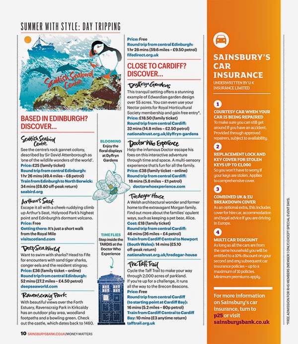
Maps and Hand Lettering for Sainsbury's Money Matters Magazine

I was delighted when Sainsbury’s Bank Money Matters Magazine asked me to create some maps and hand lettering for their Summer issues. 

The subject was day trips in the UK and it involved creating two illustrated maps for two issues, one aimed at readers interested in family entertainment and one of general interest. 

It was fascinating researching the locations found all over Britain, then creating spot illustrations to brighten up the maps. Each place name was individually hand lettered and this lettering was also used to punctuate the body copy of the articles. A smaller illustration for each map was also created for the second pages of the articles to sit alongside the spot illustrations. A hand lettered title and illustrated flag were included on the cover of the magazine to draw the reader’s eye to the article.

If you'd like to see more of my map and diagram work, click through to the maps folder on my portfolio site.