Showing posts with label Ruth Rowland lettering artist. Show all posts

Thursday, 28 September 2017

Thirty Days of Digital Lettering & Harry Potter Picturing Magic Course

By Ruth Rowland

JOURNAL: RR LA Facebook . RR LA Instagram . RR LA Twitter . British Library Picturing Magic Course


I've recently invested in a new iPad Pro and Apple Pencil and I'm enjoying exploring the array of creative apps available for this impressive mobile device.

As I progress, I've been collating a digital lettering sketchbook and I've decided to share some of the work on social media in the coming month as Thirty Days of Digital Lettering.


Murano Ampersand by Ruth Rowland Lettering Artist

To start off with, I'm experimenting with some of the Adobe Mobile Apps, which are included as part of my Adobe CC subscription. If you're interested in following along, you'll find these digitally hand lettered pieces posted on my Facebook, Instagram and Twitter accounts during October (links at top of post). 

Sassy S by Ruth Rowland Lettering Artist

The British Library Harry Potter Picturing Magic Course

I'm excited to have been asked to contribute to the Picturing Magic Course, aligned with the wonderful British Library Exhibition, Harry Potter: A History of Magic. The Course is being led by talented professional illustrator and educator, Sion Ap Tomos with specialist help from myself and creative book binder and printmaker, Shelagh McCarthy


I'll be dropping in on one of the sessions to talk to the students about their approach to annotating their hand bound and illustrated books. Needless to say, I'll also be bringing along an interesting collection of pens and inks to demonstrate the possibilities. It may not be Hogwarts but I'm still hoping to help bring a little magic to the students’ hand lettering …

Lettering on the Harry Potter Picturing Magic Course

If you'd like to join us on the course (link at top of page), there are still a few places available but be quick to sign up as these exclusive classes have limited numbers. Hope to see you there!

Tuesday, 29 August 2017

Hand Lettering for Can I Speak to Someone in Charge by Emily Clarkson

By Ruth Rowland

Publishing: Pretty Normal Me l Simon & Schuster 

I was delighted to be asked by publishers, Simon & Schuster to work on a the hand lettered book title for popular blogger, Emily Clarkson, founder of Pretty Normal Me

‘Pretty Normal Me was founded by Em Clarkson to help women be the happiest versions of themselves.’ 


Her new book, Can I Speak to Someone in Charge, is an expansion of the blog. The casual brush lettered title and side copy make for a fresh, dynamic cover and reflect the subjects she discusses in her pertinent posts.

Over the years I've worked on an interesting range of book covers, you can see more of my hand lettered titles and author logos in the publishing folder on my website.

Digital Dalliances

I've been having a lot of fun experimenting with the latest iPad Pro and Apple Pencil. Much as I love my pen and ink, it's been interesting to see just how sensitive pixels can be …


If you're interested in how digital brushes compare to conventional ones, I'll be posting further experiments on my Instagram and FB accounts.

Tuesday, 30 May 2017

Latest Welcome Campaign at Heathrow Airport

I have to confess I was pretty psyched to see the wonderful Tim Peake standing in front of my lettering at Heathrow … This is one of a series of large format posters for the latest Heathrow Welcome Campaign featuring my hand lettering. 


The posters can be seen looming large across the walls at the airport’s arrivals and departures areas and is one of the jobs that people tend to mention to me most, normally seen when returning from holiday. 


As with the Tim Peake’s poster, real people rather than models were used and a zoo keeper, a town crier, a Red Arrows pilot and even Santa (yes, he’s real!) amongst others, stand alongside the famous astronaut. See the full set of posters on the advertising page on my portfolio site.


I was commissioned by Chaos Design to create different styles of hand lettering to capture the personalities of the featured people as they welcome travellers to London. 


As you can imagine, the Welcome Campaign at Heathrow Airport is always a great project to work on but the added excitement of Tim Peake's inclusion made it an extra special commission.


Tuesday, 29 November 2016

Lettering for Kate Bush's Live Album - Before the Dawn

I was thrilled to be asked to work on the new album lettering for long-time musical hero, Kate Bush.


Before The Dawn was recorded during the extraordinary run of 22 shows performed by Kate at London’s Hammersmith Apollo, 2014 and released November 2016.


Earlier in the year, I was asked by renowned music industry designers, Stuart Crouch Creative, to develop a range of hand lettering to work with the CD cover photography and inner booklet pages. I immediately immersed myself in Kate Bush’s music, from the early albums that influenced my teenage years to the latest magical performances from the 2014 shows.


I decided to develop some loose brush work, not too formal but still legible with a striated, textural ebb and flow that complemented the richly-coloured photography taken from the showRead on ...

Limited Editions Prints

I've added a small selection of limited edition prints to my site.


Seen here is Cathy Print - an evocative quote taken from Emily Brontë's Wuthering Heights. Cathy's heartfelt words as she yearns for the days of her youth spent with Heathcliff on the moors. 

One of the perks of my job is being able to play music in the studio, so you can easily imagine what was playing while I was working on this piece ...

Thursday, 28 July 2016

Hand Lettering for Simple Minds New Gold Dream Deluxe Boxset & Country Living Video

It was exciting to be asked to work on the hand drawn lettering for the New Gold Dream Deluxe Boxset. I remember its original release in 1982, Simple Minds’ fifth studio album, taking them from revered cult status to a chart band with hit singles and a full year in the UK album chart.


With the original New Gold Dream design as a starting point, I developed a sympathetic style of pen-drawn Roman Capital lettering for four of the disc covers within this collectible boxset. The challenge was to create new custom drawn titles for the fresh designs that also worked with the original 1982 cover.


It’s always a pleasure to open up a well designed boxset and this one didn’t disappoint with its inventive packaging, wrap, ribbon and booklets - it delivered in spades. When you work on a project like this, I imagine it’s much like being an actor in a film, you understand the concept and all the parts you worked on in detail but it’s only when you see the completed piece that you appreciate the whole.  


An inspired collection of remastered album, mixes, radio sessions, videos and tv footage, the stylish design lives up to its content. If you’re a Simple Minds fan - you’ll want it in your collection.

To see the rest of the individual wallets in more detail or more of my lettering for album titles and band logos check out the music folder on my portfolio site.


Online Update: Brush Lettering for Country Living Magazine

I've enjoyed working for Country Living since their design refresh at the beginning of the year, providing hand lettered logos, titles and pull quotes for the magazine each month. Last week I was asked into their London office to be videoed in action with my brush pens. Unnerving but certainly fun!

I also have a modest set up in the studio for videoing, handling a pen and camera at the same time takes a certain amount of practice but I'm slowly getting the hang of it. You can see some of my self promotional work below for the July issue of Country Living.

To read more about the job, head over to my website editorial folder or see more of my lettering videos on my Facebook Page.


Friday, 18 March 2016

Brenda Starr Mysteries Branding

You couldn’t get a much more exciting client than feisty red-headed reporter, Brenda Starr!

Click for larger images
Brenda Starr’s origins in the 1940s had a big influence on the style of the logo. A dynamic combination of loose script and structured retro-inspired lettering kept the style fresh and contemporary with a nod to her comic roots. A simple star monogram offered a neat alternative to the full mark.


For continuity, this high impact, lipstick-red lettering has been taken across the Brenda Starr Mysteries website and book covers. It was specifically designed to complement James Boyle’s striking illustrative style, with its lively line work and dynamic colours. One of my favourite pages is a glimpse into the Starr World, a witty combination of lettering, illustration and pull quotes, introducing key characters in the series and bringing Brenda Starr firmly into modern world. 


It’s always a pleasure to be commissioned by someone of Jon Salem’s creative vision, his strong visual concept for the brand and depth of knowledge of the genre was an inspiration.


Take a moment to check out the website and enter the exciting world of Brenda Starr. The first novel, Black Orchid Murders is set for publication later this year.

Wednesday, 16 December 2015

Album Lettering for Paul Carrack's Soul Shadows

It’s been a busy few months and one of the projects I’ve really enjoyed working on is the hand lettering for Paul Carrack’s new album release, Soul Shadows.


The album has come in the wake of Paul Carrack’s time as featured vocalist and keyboard player in Eric Clapton’s band for his UK and international tour, the result of their longtime friendship and mutual respect.

I was commissioned to work on the album title and track list by Ian Ross, an old friend and much respected designer I first worked for over 20 years ago at Bill Smith Design. It was Ian who introduced me to Paul Carrack’s music some years ago, an artist well known in the industry as a ‘musician’s musician’, so I was delighted to have the chance to contribute something to the album design.


With a loose but legible letterform in mind, I decided to work with brush to create a fluid but slightly raw and not ‘too perfect’ line for the lettering. You can see the hand lettered Paul Carrack logo in use on his official website, while the album and track titles are positioned throughout the packaging design in vibrant turquoise to contrast with the soulful greys and blue-blacks of Paul Cox’s moody photography.

You can see more on this project and my hand lettering for the record industry in my music folder.


Wednesday, 28 October 2015

Simple Minds v The Stranglers Limited Edition Single Lettering

Thrilled to work on the lettering for a new single brought out by these two era-defining bands, Simple Minds and The Stranglers

To celebrate their forthcoming tour together, when The Stranglers will be special guests of Simple Minds, the bands got together to record a version of The Stranglers' 1977 punk classic, '(Get A) Grip (On Yourself)'. Influenced by The Stranglers and the Punk ethos in general, read Jim Kerr's thoughts on first seeing the band live when they performed in Glasgow.


Created with a pen I made specifically to capture the raw energy and anarchism of Punk, I hand lettered the single title and added it to distressed versions of the bands' iconic logos. I had some fun working on a range of options (some of which you can see on my website) before this version was settled on.  It was then printed as a limited edition onto collectible 7" white vinyl in black and vibrant green.

You can see more of my work for Simple Minds and the music industry here.


Friday, 16 October 2015

Cliff Richard Album Lettering, 75 at 75


It was great to be asked to work on Cliff Richard’s latest release, a triple-disc collection of his greatest hits celebrating his 75th birthday, called appropriately, 75 at 75.

It includes a new song, Golden, a tribute to his famously loyal fans and with that in mind, the cover was designed as a visual reminder of his first album cover, Cliff, released in 1959. Devoted fans who have the record in their collection will see that the the original title lettering has been reused in celebration of his 75 years in the industry.

It was good fun getting out my brushes, listening to some of Cliff’s early hits for inspiration and working on the Living Doll and Move It track titles to develop a sympathetic lettering style to the original 50’s lettering.

Happy Birthday Cliff!


Saturday, 26 September 2015

New Logo for St Luke's Hospice

I always enjoy working on branding, so when Ledgard Jepson Design contacted me to help out with a new logo for St Luke’s Hospice, Sheffield, I jumped at the chance.

Ledgard Jepson, specialists in branding and well known for their recent rebrand of Birmingham Museums Trust, worked closely with the client to develop a logo that evokes a positive, upbeat message. After much care and consideration, it was decided this was best achieved with a piece of custom lettering, giving St Luke’s Hospice a unique, hand drawn mark that is instantly recognisable. 

Once briefed, I collaborated with the creative team at Ledgard Jepson, providing initial brush drawn options. These were gradually developed and drawn up digitally, while taking care to retain the hand drawn appeal of the script.

The warm colour, soft curves and playful nod at smiles and hearts keep the lettering fresh and friendly, while the bold weight and clean design give it the visual strength to work across a range of applications.

You can see more of my lettering for branding in the logos folder on my portfolio website.


Friday, 21 August 2015

Hand Lettered Pilot Pens Ad Campaign

It was great to be asked to work on this follow up campaign for Pilot Pens.


Each ad was hand written using the featured pen. I had great fun working with the stylish erasable FriXion Clicker, the edgy MR Animal Collection fountain pen and the intriguing and beautifully designed Vanishing Point, with its unusual retractable fountain pen nib. The perfect job for someone who loves pens!


If you’d like to see more of my work for Pilot Pens or advertising in general click through to my website.


Friday, 27 March 2015

Hand Lettering for Simple Minds Big Music Tour Guide

It was great to be working for Simple Minds again - producing the hand rendered lettering for the beautifully designed 2015 Big Music Tour Guide.

In keeping with the ongoing trend for vernacular lettering, this tonal brush lettering is laid over the atmospheric tour shots, capturing and intensifying the immediacy of the moment. The bright, raw lettering compliments the vibrant photography and adds a pop of colour to moody grayscale shots.

If you’d like to see more of my Simple Minds work, check out the music folder on my website.


Sunday, 28 September 2014

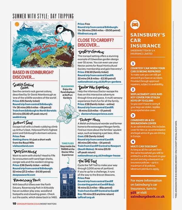
Maps and Hand Lettering for Sainsbury's Money Matters Magazine

I was delighted when Sainsbury’s Bank Money Matters Magazine asked me to create some maps and hand lettering for their Summer issues. 

The subject was day trips in the UK and it involved creating two illustrated maps for two issues, one aimed at readers interested in family entertainment and one of general interest. 

It was fascinating researching the locations found all over Britain, then creating spot illustrations to brighten up the maps. Each place name was individually hand lettered and this lettering was also used to punctuate the body copy of the articles. A smaller illustration for each map was also created for the second pages of the articles to sit alongside the spot illustrations. A hand lettered title and illustrated flag were included on the cover of the magazine to draw the reader’s eye to the article.

If you'd like to see more of my map and diagram work, click through to the maps folder on my portfolio site.


Friday, 27 June 2014

The Field of Cloth of Gold Hand Lettered Book Title

It was great to work on the title lettering for The Field of Cloth of Gold by Glenn Richardson.

A major Tudor event, The Field of Cloth of Gold, was a spectacular festival of competition and entertainment which aimed to secure a permanent settlement between England and France in 1520.

With that in mind, the title lettering had to be suitably ornate with a flavour of the period, while still being legible enough to read amongst a shelf of books. I opted for a loose informal hand and had some fun with the flourishes.

You can see more historic book title lettering in the publishing folder on my site.