Showing posts with label lettering Ruth Rowland. Show all posts
Tuesday, 30 May 2017
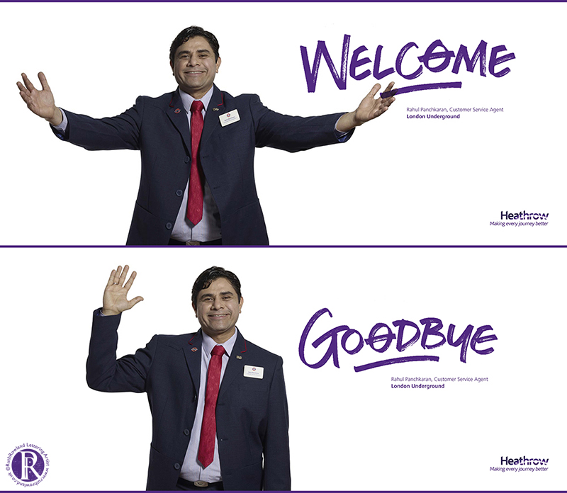
Latest Welcome Campaign at Heathrow Airport
I have to confess I was pretty psyched to see the wonderful Tim Peake standing in front of my lettering at Heathrow … This is one of a series of large format posters for the latest Heathrow Welcome Campaign featuring my hand lettering.
The posters can be seen looming large across the walls at the airport’s arrivals and departures areas and is one of the jobs that people tend to mention to me most, normally seen when returning from holiday.
As with the Tim Peake’s poster, real people rather than models were used and a zoo keeper, a town crier, a Red Arrows pilot and even Santa (yes, he’s real!) amongst others, stand alongside the famous astronaut. See the full set of posters on the advertising page on my portfolio site.
I was commissioned by Chaos Design to create different styles of hand lettering to capture the personalities of the featured people as they welcome travellers to London.
As you can imagine, the Welcome Campaign at Heathrow Airport is always a great project to work on but the added excitement of Tim Peake's inclusion made it an extra special commission.
Tuesday, 20 December 2016
Meadowhall & Gloucester Quays Christmas lettering but most importantly, naughty or nice?
With 25 years experience of working with market-leading brands, Jepson Ledgard has designed an eye-catching series of campaigns to showcase the centre’s many attractions. With an eye for detail as well as the big picture, the creative team suggested bespoke lettering with a loose and contemporary feel, to complement the fresh photography and stylish designs across the site.
It’s always encouraging when a client understands a designer’s creative vision and the result has been a series of stylish campaigns, marking Meadowhall out as a premium shopping centre.
You can see the heart-warming Christmas campaign Read on ...
Christmas Lettering for Gloucester Quays
It was great to be asked by FKC London to work on their Christmas campaign lettering, Experience More Magic, for Gloucester Quays this year.
The brief was to create lettering that was stylish and contemporary with a festive feel. I focused on crisp Didone letterforms combined with celebratory stars and flourishes to add some magical Read on ...
And Last but Not Least ...
Today is my last day in the studio before Christmas, I'm back at the drawing board in the New Year on the 3rd January.
A big thank you to all people I've worked with this year, I've had some fabulous jobs and I look forward to teaming up with you again next year. If we haven't worked together yet but you'd like to - please feel free to email me with you thoughts on potential projects.
So, the big question - have you been naughty or nice? However your year has been, I hope you're at the top of Santa's list ...
Merry Christmas!
Friday, 28 October 2016
Lettering for Simple Minds Acoustic Album
It was great to be asked to continue my work for Simple Minds with some lettering on their latest album, Acoustic.
Taking the acoustic guitar as inspiration for the album design, Stuart Crouch Creative asked me to create the track list in a combination of scratched and marker lettering styles, harking back to the punk era. Read on ...
I was delighted to see the mesmerising videos created by Able Media using my lettering. There are five videos, focusing on different tracks on the album. Here's the lead single, featuring a collaboration with KT Tunstall.
It's that time of year again, I couldn’t resist the opportunity for a bit more hairy lettering to celebrate Halloween - hope you all have a scarily great time!
I was delighted to see the mesmerising videos created by Able Media using my lettering. There are five videos, focusing on different tracks on the album. Here's the lead single, featuring a collaboration with KT Tunstall.
There’s just something magical about watching the lettering create itself ...
Happy Halloween!
It's that time of year again, I couldn’t resist the opportunity for a bit more hairy lettering to celebrate Halloween - hope you all have a scarily great time!
If this makes you smile, you can see more of my ballpoint pen sketches on Instagram.
Tuesday, 30 August 2016
Sarah Billing Logo & My Map of You Hand Lettered Book Title
It was a pleasure to work on the lettering and illustration for Sarah Billing's logo commissioned by Work Design Creative Partners.
A qualified ‘Colour Me Beautiful’ consultant, Sarah approached Work Design to develop a logo that would reflect the bespoke nature of her new personal style and colour advice service.
Sarah’s expertise means ... Read on
Sneak Peak: My Map of You Book Title Lettering
I was delighted to work on the titling for the debut novel of author, Isabelle Broom published by Penguin Michael Joseph. Hats off to the design team for coming up with such an entrancing cover, I loved working on this loose brush lettering. There are more titles to come, so once I can, I'll post the set in the publishing folder on my website. Meanwhile, for a quick hand lettered book title fix, head over there now ...
Thursday, 28 July 2016
Hand Lettering for Simple Minds New Gold Dream Deluxe Boxset & Country Living Video
It was exciting to be asked to work on the hand drawn lettering for the New Gold Dream Deluxe Boxset. I remember its original release in 1982, Simple Minds’ fifth studio album, taking them from revered cult status to a chart band with hit singles and a full year in the UK album chart.
With the original New Gold Dream design as a starting point, I developed a sympathetic style of pen-drawn Roman Capital lettering for four of the disc covers within this collectible boxset. The challenge was to create new custom drawn titles for the fresh designs that also worked with the original 1982 cover.
It’s always a pleasure to open up a well designed boxset and this one didn’t disappoint with its inventive packaging, wrap, ribbon and booklets - it delivered in spades. When you work on a project like this, I imagine it’s much like being an actor in a film, you understand the concept and all the parts you worked on in detail but it’s only when you see the completed piece that you appreciate the whole.
An inspired collection of remastered album, mixes, radio sessions, videos and tv footage, the stylish design lives up to its content. If you’re a Simple Minds fan - you’ll want it in your collection.
To see the rest of the individual wallets in more detail or more of my lettering for album titles and band logos check out the music folder on my portfolio site.
Online Update: Brush Lettering for Country Living Magazine
I've enjoyed working for Country Living since their design refresh at the beginning of the year, providing hand lettered logos, titles and pull quotes for the magazine each month. Last week I was asked into their London office to be videoed in action with my brush pens. Unnerving but certainly fun!
I also have a modest set up in the studio for videoing, handling a pen and camera at the same time takes a certain amount of practice but I'm slowly getting the hang of it. You can see some of my self promotional work below for the July issue of Country Living.
To read more about the job, head over to my website editorial folder or see more of my lettering videos on my Facebook Page.
With the original New Gold Dream design as a starting point, I developed a sympathetic style of pen-drawn Roman Capital lettering for four of the disc covers within this collectible boxset. The challenge was to create new custom drawn titles for the fresh designs that also worked with the original 1982 cover.
It’s always a pleasure to open up a well designed boxset and this one didn’t disappoint with its inventive packaging, wrap, ribbon and booklets - it delivered in spades. When you work on a project like this, I imagine it’s much like being an actor in a film, you understand the concept and all the parts you worked on in detail but it’s only when you see the completed piece that you appreciate the whole.
An inspired collection of remastered album, mixes, radio sessions, videos and tv footage, the stylish design lives up to its content. If you’re a Simple Minds fan - you’ll want it in your collection.
To see the rest of the individual wallets in more detail or more of my lettering for album titles and band logos check out the music folder on my portfolio site.
Online Update: Brush Lettering for Country Living Magazine
I've enjoyed working for Country Living since their design refresh at the beginning of the year, providing hand lettered logos, titles and pull quotes for the magazine each month. Last week I was asked into their London office to be videoed in action with my brush pens. Unnerving but certainly fun!
I also have a modest set up in the studio for videoing, handling a pen and camera at the same time takes a certain amount of practice but I'm slowly getting the hang of it. You can see some of my self promotional work below for the July issue of Country Living.
To read more about the job, head over to my website editorial folder or see more of my lettering videos on my Facebook Page.
Friday, 6 March 2015
Save Kids Lives Poster
I love it when my work supports a good cause, so when Scholastic contacted me to work on a poster for Save Kids Lives, I jumped at the chance.
Scholastic, Safe Kids Worldwide, and its partners invite families to help keep kids safe on the road. More than 500 children die every day in traffic crashes and thousands more are injured. This inventive new campaign offers parents and teachers information and advice to highlight the problem to policymakers by writing letters and posting #safies or selfies online. The sites include family action packs and curriculum-focused road safety awareness lessons amongst a wealth of other helpful information.
My part in the campaign was to design and illustrate a poster for inclusion on both parent and teacher sites. Entitled, Our Declaration for Global Road Safety, its aim is both to appeal to and speak out for children. I wanted to keep it upbeat with bright, eye-catching colours and had fun combining naive letterforms, stencilling and textures with simple spot illustrations. A pdf of the poster is available to download on both parent and teacher sites.
If you have a minute, support the cause and sign the Child Declaration to help keep our kids safe on the roads.
Friday, 27 February 2015
Sketch Advertising Agency Promotional Lettering
Innovative British advertising agency, Sketch asked me to work on their new website and promotional material.
Tonal wild and loose lettering reflected their fresh and creative approach to projects. I was delighted to see the work come alive with animated title screens throughout their site. You can browse the animated pieces here.
In the words of Sketch’s Head of Design and Technology, Luke Wotton:
"We were looking for something that expressed the business ethos of Sketch on an emotional level. Ruth's work communicates the passion and commitment that we all have to creativity here."
Want to see me in action? See me demonstrating gestural calligraphy here.
Tuesday, 16 December 2014
The Art of McCartney Album Lettering
I was thrilled to be asked to work on the album lettering for The Art of McCartney.
Nearly 40 artists came together to contribute to this long awaited album, celebrating the songwriting of Sir Paul McCartney. Artists including Billy Joel, Bob Dylan, Brian Wilson, Willie Nelson, Alice Cooper, Smokey Robinson, The Cure, Chrissie Hynde and Kiss perform tracks from the former Beatle’s back catalogue. A fascinating documentary was also made of behind-the-scenes at the recording sessions.
I was asked to hand letter the names of the artists in a loose but legible script to fit within the square format for the vinyl and CD albums and box sets. Each layout was custom fitted to work with the individual products.
It’s always interesting working on music projects, but this one involved such an eclectic mix of famous artists, it was exciting to learn the line-up as they signed up to the album.
You can see more of this sort of work in my music folder on my website.
Monday, 1 December 2014
Dr Who DVD & Blu-ray Lettering
I’m always excited to work for Dr Who and this project was no exception.
After the recent success of the eighth BBC series with the Twelfth Doctor, the wonderful Peter Capaldi, I was delighted to work on the DVD and Blu-ray packaging. Asked to hand letter the chalkboard programme titles for the series, I took inspiration from the new TARDIS set. Playing around with the idea of chalk drawn mathematical equations and diagrams, I used arrows to organise the titles in the hexagonal space on the back covers.
If you’d like to see more of my Dr Who work it can be found in the TV folder on my website.
Friday, 16 December 2011
Snow Queen Trail
In the weeks leading up to Christmas, the Rose Theatre, Kingston has been presenting a range of special performances to celebrate their adaptation of Hans Christian Andersen's The Snow Queen.
I was asked to create an illustrated map that would show the route of the four story houses, where the events are taking place. Using storytelling and songs, a group of travelling players are performing short adaptations of some of Andersen's fairy tales, creating a magical trail though Kingston's streets.
Click here to see more of my illustrated maps on my portfolio site.
Merry Christmas everyone!
Labels:
lettering Ruth Rowland,
map,
Snow Queen Trail
Saturday, 30 April 2011
Jennifer Weiner Titles
I was asked to work on some hand lettered titles for talented designer/illustrator Lizzie Gardiner at Simon & Schuster Publishing. The lettering had to compliment Lizzie's stylish illustrations for an eye catching series of covers for Jennifer Weiner's latest novels. You may have seen the film of her book, In Her Shoes with Cameron Diaz.

The soft brush curves and playful flourishes give the lettering feminine appeal while still being bold and legible enough to stand out on the shelf. There's more in the set - so watch out for them in your local bookstore ...

You can see more of my publishing work in my word>publishing folder on my portfolio website.
Tuesday, 31 August 2010
John Lennon's 70th Birthday
I was thrilled to be asked to work on the John Lennon 'Gimme Some Truth' Campaign to commemorate his 70th birthday, which falls on 9th October.
Overseen by Yoko Ono and EMI Music, the campaign will launch on 4 October (5 October in North America) with the worldwide release of eight digitally remastered studio albums and several newly-compiled titles. 'Double Fantasy', 1980’s GRAMMY Award winner for Album of the Year, will be presented in a new 'Stripped Down' version remixed and produced by Yoko Ono and Jack Douglas, co-producers of the original mix with John Lennon.
I was born and raised in Liverpool so this project held particular significance for me, it was wonderful to be to be involved. You can see more of my music work in my word>music folder on my site.
Subscribe to:
Posts (Atom)